In our previous [tutorial](./02_Quick_start_simulation_data.ipynb), we applied GNN for learning spatial neighbourhood structures in a simulated spatial transcripts data. We used radius graph with radius set as 3 microns. The `radius_r` used for building the spatial RNA-graph is essential and controls the level of spatial aggregation. In this notebook, we explore the effect of large or small radius values in combination with the clustering resolution.

We will examine the results with varying radius values, including [0.5, 1, 3, 5, 15].
import pandas as pd
import matplotlib.pyplot as plt
import numpy as np
import random
import itertools
import os
from sklearn.cluster import KMeans
data_dir = "/mnt/beegfs/mccarthy/general/backed_up/rlyu/Projects/spatialrna_ms_revision2025/"
k_list = [10,6,5,3,2]ground_truth_rgb = pd.read_csv(data_dir+"data/simulated/model.rgb.tsv",sep="\t")
#set(ground_truth_label.cell_label)
c_array = np.array(ground_truth_rgb[["R","G","B"]])
color_m = dict(zip(ground_truth_rgb.cell_label,range(0,10)))
ground_truth_label = pd.read_csv(data_dir+"data/simulated/pixel_label.uniq.tsv.gz",sep="\t")
ground_truth_label
ground_truth_label["ori_id"] = [x for x in range(ground_truth_label.shape[0])]input_tx = pd.read_csv(data_dir+"data/simulated/matrix.tsv.gz",sep="\t")
ground_truth_label["gene"] = input_tx["gene"]
# ground_truth_label["Count"] = 1
ground_truth_labelThe clustering labels by different radius and k
We load the clustering results that were obtained from different input radius for graph construction and different number of clusters.
kmeans_labels_df = pd.read_csv("../data/radius_and_k.csv",index_col=0)
kmeans_labels_df## define helper function for matching Kmeans labels with groundtruth labels
from sklearn.metrics import confusion_matrix
from sklearn.metrics import adjusted_rand_score
def find_cell_label_prop_in_k(kmeans_labels, ground_truth_label):
contingency_table = pd.crosstab(ground_truth_label.cell_label, [str(x) for x in kmeans_labels])
long_format = contingency_table.stack().reset_index()
long_format.columns = ['cell_label', 'kmean_label', 'Count']
long_format['Proportion'] = long_format.groupby('cell_label')['Count'].transform(lambda x: x / x.sum())
return long_format
'''
match the derived kmeans labels to cell type labels, simply by confusion matrix
'''
def assign_cell_label(kmeans_labels, ground_truth_label):
contingency_table = pd.crosstab(ground_truth_label.cell_label, [str(x) for x in kmeans_labels])
long_format = contingency_table.stack().reset_index()
long_format.columns = ['cell_label', 'kmean_label', 'Count']
long_format['Proportion'] = long_format.groupby('cell_label')['Count'].transform(lambda x: x / x.sum())
match_pair = long_format.iloc[long_format.groupby('cell_label')['Proportion'].idxmax()]
match_pair_dict = dict(zip(match_pair.kmean_label,match_pair.cell_label))
return match_pair,match_pair_dict
def calculate_ari(kmeans_labels, ground_truth_label):
res = adjusted_rand_score(kmeans_labels,ground_truth_label.cell_label)
return res
matched_pairs = {}
for col_n in kmeans_labels_df.columns:
    matched_pairs[col_n] = assign_cell_label(kmeans_labels_df[col_n],ground_truth_label)
confusion_list = {}
for col_n in kmeans_labels_df.columns:
confusion_list[col_n] = find_cell_label_prop_in_k(kmeans_labels_df[col_n],ground_truth_label)ari_list = {}
for col_n in kmeans_labels_df.columns:
ari_list[col_n] = calculate_ari(kmeans_labels_df[col_n],ground_truth_label)kmeans_labels_df.columnsIndex(['r0.5_k10', 'r0.5_k6', 'r0.5_k5', 'r0.5_k3', 'r0.5_k2', 'r1_k10',
'r1_k6', 'r1_k5', 'r1_k3', 'r1_k2', 'r3_k10', 'r3_k6', 'r3_k5', 'r3_k3',
'r3_k2', 'r5_k10', 'r5_k6', 'r5_k5', 'r5_k3', 'r5_k2', 'r15_k10',
'r15_k6', 'r15_k5', 'r15_k3', 'r15_k2'],
dtype='object')confusion_list.keys()dict_keys(['r0.5_k10', 'r0.5_k6', 'r0.5_k5', 'r0.5_k3', 'r0.5_k2', 'r1_k10', 'r1_k6', 'r1_k5', 'r1_k3', 'r1_k2', 'r3_k10', 'r3_k6', 'r3_k5', 'r3_k3', 'r3_k2', 'r5_k10', 'r5_k6', 'r5_k5', 'r5_k3', 'r5_k2', 'r15_k10', 'r15_k6', 'r15_k5', 'r15_k3', 'r15_k2'])For example, we can have a look at column r15_k10 in confusion_list, it shows for each cell_label, the proportion of each kmeans_label.
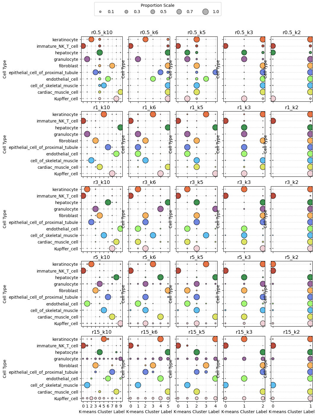
confusion_list["r15_k10"]Transcripts assigned in Kmeans labels for each radius and K combination across cell types
We next calculate for each radius and K combination, for each cell type, the proportion of transcripts assigned into each cluster.
import seaborn as sns
import matplotlib.pyplot as plt
plt.style.use('default')
plt.rcParams['figure.facecolor'] = 'white'
plt.rcParams['figure.dpi'] = 100
# mapping from cell_label to RGB hex colors
def rgb_to_hex(r, g, b):
    return "#{:02x}{:02x}{:02x}".format(int(r*255), int(g*255), int(b*255))

# Add hex color to the color_df
ground_truth_rgb['hex'] = ground_truth_rgb.apply(lambda row: rgb_to_hex(row['R'], row['G'], row['B']), axis=1)

# Create a mapping from cell_label to hex color
color_map = dict(zip(ground_truth_rgb['cell_label'], ground_truth_rgb['hex']))
fig, axes = plt.subplots(5, 5, figsize=(12, 15), sharey=True)

for idx, (radii, ax) in enumerate(zip(confusion_list.keys(), axes.flatten())):
    #print(idx)
    df = confusion_list[radii].copy()
    #print(df.shape)
    df['color'] = df['cell_label'].map(color_map)
    ax.scatter(
        x=df['kmean_label'],
        y=df['cell_label'],
        s=df['Proportion'] * 200,
        c=df['color'],
        alpha=0.8,
        edgecolors="k"
    )

    ax.set_title(f"{radii}")
    ax.set_xlabel("K-means Cluster Label")
    ax.set_ylabel("Cell Type")
    ax.grid(True, linestyle='--', linewidth=0.5, alpha=0.6)
    if idx < 20:  # Rows 0–3 (5x5 grid => last row is idx 20–24)
        ax.set_xticklabels([])
        ax.set_xlabel("")

## set legend
from matplotlib.lines import Line2D

# Example sizes (adjust as needed based on your data's scale)
example_sizes = [0.1, 0.3, 0.5, 0.7, 1.0]
scale_factor = 200  # same as used in scatterplot

# Create legend elements
legend_elements = [
    Line2D(
        [0], [0],
        marker='o',
        color='w',
        label=f'{s:.1f}',
        markersize=(s * scale_factor)**0.5,  # Size is sqrt of area
        markerfacecolor='gray',
        alpha=0.6,
        markeredgecolor='k'
    ) for s in example_sizes
]

# Add to figure
fig.legend(
    handles=legend_elements,
    title='Proportion Scale',
    loc='upper center',  # or 'upper right', etc.
    ncol=len(example_sizes),
    frameon=True
)
plt.tight_layout(pad=1)
plt.subplots_adjust(
    left=0.25,    # Left side of subplots
    right=0.9,   # Right side
    top=0.92,     # Top margin
    bottom=0.1,  # Bottom margin
    wspace=0.15,  # Width spacing between subplots
    hspace=0.15   # Height spacing between subplots
)
#plt.subplots_adjust(top=0.15)  # Increase bottom margin (try 0.2 if needed)

plt.savefig("../figures/combined_r_k_ct_prop.png", dpi=300)
plt.show()
Plot spatially
plt.style.use('dark_background')
plt.rcParams['figure.facecolor'] = 'black'
plt.rcParams['figure.dpi'] = '100'
plt.rcParams["scatter.marker"]= ','

plot_res = kmeans_labels_df.columns
palette = sns.color_palette("Paired", n_colors=kmeans_labels_df[plot_res[0]].nunique())

## plots color by the mapped cell label
fig,axes = plt.subplots(5,5,figsize=(15,15),sharey=True)
for col_n, ax in zip(plot_res, axes.flatten()):
    labels = kmeans_labels_df[col_n].values
    unique_labels = np.unique(labels)
    # Create a mapping from cluster label to color
    color_map = {label: palette[i % len(palette)] for i, label in enumerate(unique_labels)}

    # Map colors to each data point
    colors = [color_map[label] for label in labels]
    ax.scatter(
        x=ground_truth_label.X,
        y=ground_truth_label.Y,
        s=0.1,
        c=colors,
        alpha=1,
        marker=","
    )
    ax.set_title(col_n)
    ax.axis("off")
    ax.axis('equal')
plt.tight_layout()
plt.savefig("../figures/radius_and_kv2.png",dpi=300)
plt.show()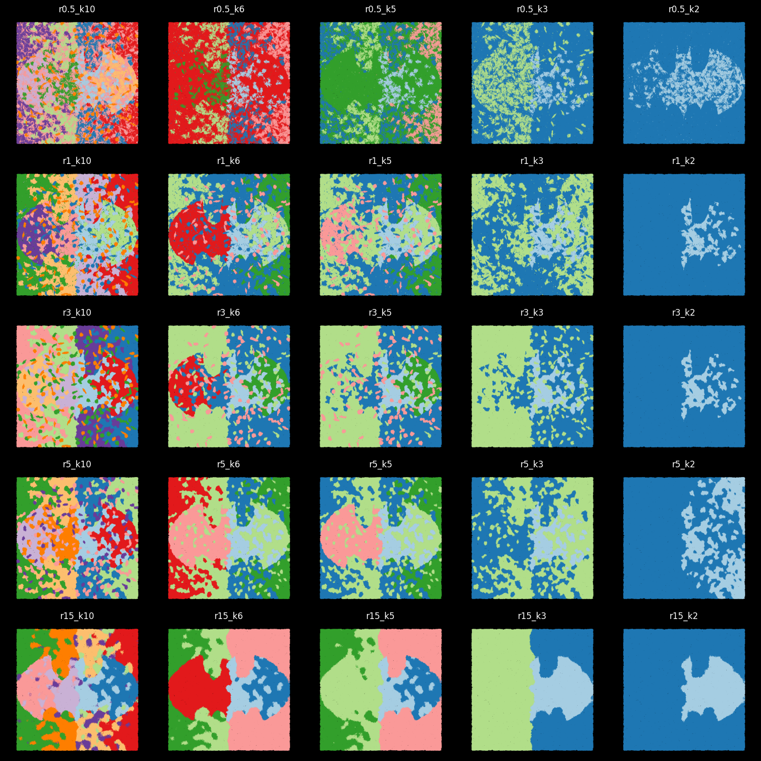
For 10-cluster results, we can match Kmean labels to the 10 ground-truth cell labels
matched_pairs['r0.5_k10']( cell_label kmean_label Count Proportion
8 Kupffer_cell 8 40191 0.820476
19 cardiac_muscle_cell 9 32710 0.812207
25 cell_of_skeletal_muscle 5 32827 0.824136
36 endothelial_cell 6 50875 0.782728
43 epithelial_cell_of_proximal_tubule 3 55381 0.814055
57 fibroblast 7 63849 0.811379
61 granulocyte 1 51390 0.905248
74 hepatocyte 4 41559 0.982227
80 immature_NK_T_cell 0 34814 0.813297
92 keratinocyte 2 62443 0.834521,
{'8': 'Kupffer_cell',
'9': 'cardiac_muscle_cell',
'5': 'cell_of_skeletal_muscle',
'6': 'endothelial_cell',
'3': 'epithelial_cell_of_proximal_tubule',
'7': 'fibroblast',
'1': 'granulocyte',
'4': 'hepatocyte',
'0': 'immature_NK_T_cell',
'2': 'keratinocyte'})kmeans_labels_df_labels = kmeans_labels_df[["r0.5_k10","r1_k10","r3_k10","r5_k10"]].copy()
for col_n in kmeans_labels_df_labels.columns:
kmeans_labels_df_labels[col_n] = kmeans_labels_df_labels[col_n].astype(str).map(matched_pairs[col_n][1]).valuesprint(ari_list){'r0.5_k10': 0.6360496037165597, 'r0.5_k6': 0.29072535393494886, 'r0.5_k5': 0.29282424387856426, 'r0.5_k3': 0.14973820002563204, 'r0.5_k2': 0.09266537890009367, 'r1_k10': 0.9184400845034655, 'r1_k6': 0.5498884407363157, 'r1_k5': 0.48460259049424115, 'r1_k3': 0.23720468043557869, 'r1_k2': 0.03576575573685528, 'r3_k10': 0.9084927306439161, 'r3_k6': 0.48639892319516387, 'r3_k5': 0.3963355191463681, 'r3_k3': 0.24294939510110158, 'r3_k2': 0.037203280286528924, 'r5_k10': 0.8677415695668176, 'r5_k6': 0.5335609853725009, 'r5_k5': 0.4573453033239519, 'r5_k3': 0.2309924739633567, 'r5_k2': 0.10776133994359129, 'r15_k10': 0.623075072848499, 'r15_k6': 0.47500113491479334, 'r15_k5': 0.38899618145745923, 'r15_k3': 0.26424046086530917, 'r15_k2': 0.07907475083168604}
| r\k | k10 | k6 | k5 | k3 | k2 |
|---|---|---|---|---|---|
| r0.5 | 0.64 | 0.29 | 0.29 | 0.15 | 0.09 |
| r1 | 0.92 | 0.55 | 0.48 | 0.24 | 0.04 |
| r3 | 0.91 | 0.49 | 0.40 | 0.24 | 0.04 |
| r5 | 0.87 | 0.53 | 0.46 | 0.23 | 0.11 |
| r15 | 0.62 | 0.48 | 0.39 | 0.26 | 0.08 |
kmeans_labels_df_labelsplt.style.use('dark_background')
plt.rcParams['figure.facecolor'] = 'black'
plt.rcParams['figure.dpi'] = 150
n_panels = len(kmeans_labels_df_labels.columns)
ncols = int(np.ceil(n_panels / 3))
nrows = 2
fig, axes = plt.subplots(nrows, ncols, figsize=(8,8), sharey=True)
axes = axes.flatten()
for i, col_n in enumerate(kmeans_labels_df_labels.columns):
axes[i].scatter(
x=ground_truth_label.X, y=ground_truth_label.Y, s=0.01,
c=[c_array[color_m[str(x)]] for x in kmeans_labels_df_labels[col_n]],
alpha=1,marker='.'
)
axes[i].set_title(col_n + " ARI: " + "{:.3f}".format(ari_list[col_n]))
axes[i].axis("off")
# Hide any unused axes
for j in range(i+1, len(axes)):
axes[j].axis("off")
plt.tight_layout()
plt.savefig("../figures/r_k10.png",dpi=300)
plt.show()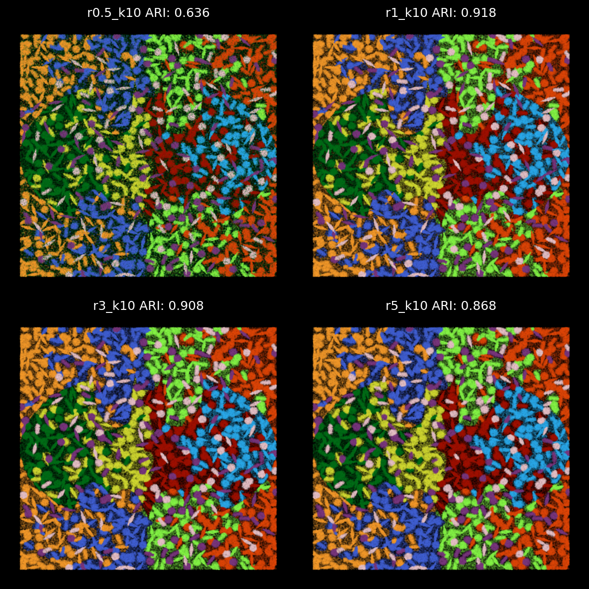
plt.style.use('dark_background')
plt.rcParams['figure.facecolor'] = 'black'
plt.rcParams['figure.dpi'] = 150

n_panels = len(kmeans_labels_df_labels.columns)
ncols = int(np.ceil(n_panels / 3))
nrows = 2

fig, axes = plt.subplots(nrows, ncols, figsize=(5, 5), sharey=True)
axes = axes.flatten()

for i, col_n in enumerate(kmeans_labels_df_labels.columns):
    axes[i].scatter(
        x=ground_truth_label.X, y=ground_truth_label.Y, s=0.1,
        c=[c_array[color_m[str(x)]] for x in kmeans_labels_df_labels[col_n]],
        alpha=0.8,marker='o'
    )
    axes[i].set_title(col_n + " ARI: " + "{:.3f}".format(ari_list[col_n]))
    axes[i].axis("off")
    axes[i].set_xlim(100,300)
    axes[i].set_ylim(100,300)

# Hide any unused axes
for j in range(i+1, len(axes)):
    axes[j].axis("off")

plt.tight_layout()
plt.savefig("../figures/r_k10_100_300_square.png",dpi=300)
plt.show()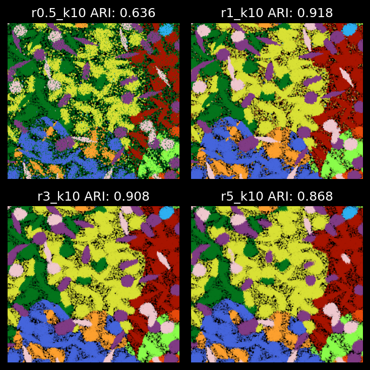
kmeans_labels_df_labelsShow ‘bad-assignment’ only
plt.style.use('dark_background')
plt.rcParams['figure.facecolor'] = 'black'
plt.rcParams['figure.dpi'] = '150'
plt.rcParams["scatter.marker"]= ','
plot_res = kmeans_labels_df_labels.columns
## plots color by the mapped cell label
fig,axes = plt.subplots(2,2,figsize=(5,5),sharey=True,sharex=True)
for col_n,ax in zip(plot_res,axes.flatten()):
    select_tx = ground_truth_label.cell_label != kmeans_labels_df_labels[col_n]

    ax.scatter(x = ground_truth_label[select_tx].X,y = ground_truth_label[select_tx].Y,
                    s=0.1,c=[c_array[color_m[str(x)]] for x in ground_truth_label[select_tx]["cell_label"]],alpha=1)

    acc_val = sum(ground_truth_label.cell_label == kmeans_labels_df_labels[col_n])/ground_truth_label.shape[0]

    ax.set_title( col_n +" ARI: "+"{:.3f}".format(ari_list[col_n]),size=7)
    ax.axis("off")
    ax.set_ylim(100,300)
    ax.set_xlim(100,300)

plt.tight_layout()
plt.savefig("../figures/zoom_in_bad_assignment.png",dpi=300)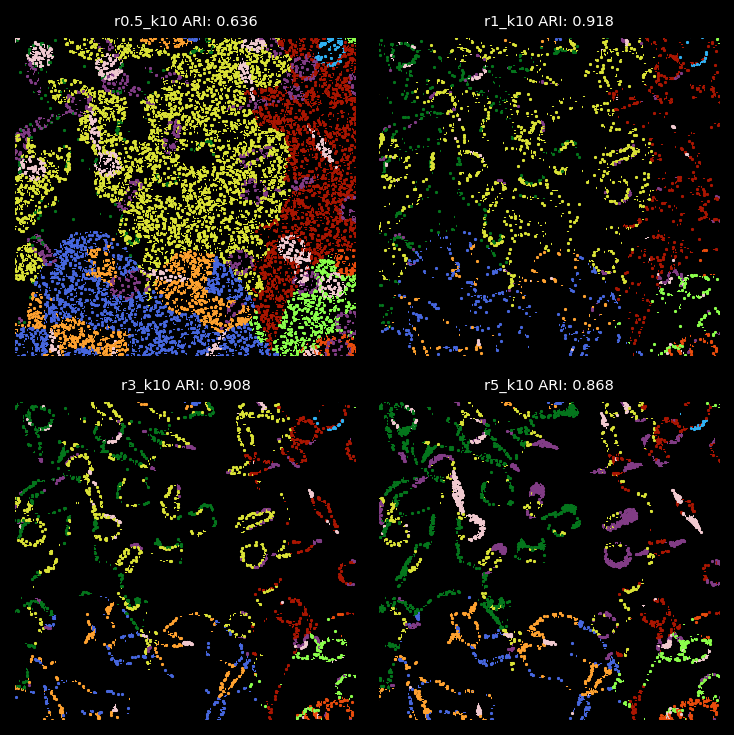
kmeans_labels_df_labelsplt.rcParams['figure.facecolor'] = 'black'
fig, ax = plt.subplots(figsize=(4, 6),dpi=300)
ax.axis("off")
# Create legend handles (colored circles)
handles = [
plt.Line2D([0], [0], marker="o", color="black", markerfacecolor=row["hex"], markersize=10)
for _, row in ground_truth_rgb.iterrows()
]
# Add legend
ax.legend(handles, ground_truth_rgb["cell_label"], loc="center", frameon=False, title="Cell Types")
plt.savefig('../figures/truth_legend.png',dpi=300)
plt.close()plt.style.use('dark_background')
plt.rcParams['figure.facecolor'] = 'black'
plt.rcParams['figure.dpi'] = '150'
plt.rcParams["scatter.marker"]= ','
plot_res = kmeans_labels_df_labels.columns
## plots color by the mapped cell label
fig,axes = plt.subplots(2,2,figsize=(5,5),sharey=True,sharex=True)
for col_n,ax in zip(plot_res,axes.flatten()):
select_tx = ground_truth_label.cell_label != kmeans_labels_df_labels[col_n]
ax.scatter(x = ground_truth_label[select_tx].X,y = ground_truth_label[select_tx].Y,
s=0.1,c=[c_array[color_m[str(x)]] for x in kmeans_labels_df_labels[col_n][select_tx]],alpha=1)
#acc_val = sum(ground_truth_label.cell_label == kmeans_labels_df_labels[col_n])/ground_truth_label.shape[0]
ax.set_title( col_n +" ARI: "+"{:.3f}".format(ari_list[col_n]),size=7)
ax.axis("off")
ax.set_ylim(100,300)
ax.set_xlim(100,300)
plt.tight_layout()
plt.savefig("../figures/zoom_in_bad_assignment2.png",dpi=300)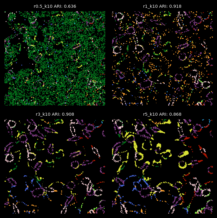
Summary
From the analysis above, the radius used for graph construction determines the size of spatial neighborhoods for information aggregation. A larger radius with fewer number of clusters leads to broader domain identification, while a smaller radius captures more localized structures. Since we applied 2-hop GNN model, the effective spatial aggregation for each focal node/transcript equals 2 times of the radius. In the simulation data, we find that radii of 1 or 3 are optimal for detecting the 10 simulated cell types with cell diameters or lengths roughly 12.